Hockey players in a country obsessed with rugby often have to bring their own passion to their international teams. Teams who are competitive, successful, proud and hard-working. Seen as a lower-level sport (despite being often ranked in the top 3 sports played around the world), New Zealanders haven't yet been captivated by the fast-paced, action-oriented and free-flowing nature of the sport.
Competing with the All Blacks, an international brand in a sport played by far fewer people, there's a real opportunity to revisit how New Zealanders and the world view the Black Sticks. This opportunity would create a lasting effect for future generations of young sportspeople, and cement a sense of national pride if the right measures were taken to make the sport accessible to watch and appreciate.
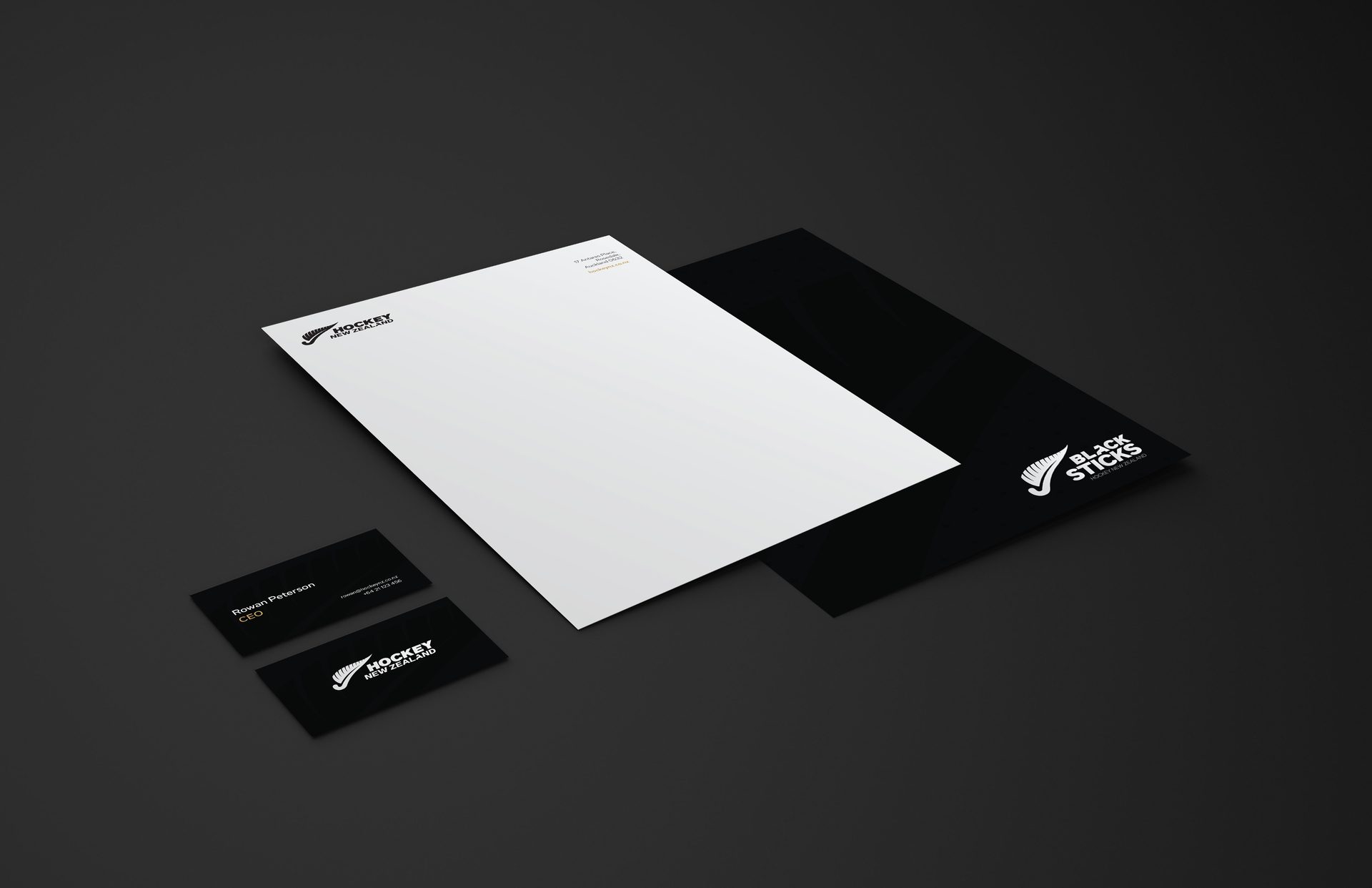
Through a revitalisation of the brand and a redirection of the messaging it portrays, we at Fury believe there are massive opportunities for the sport of hockey here in New Zealand. This case study explores the ways that can be achieved.
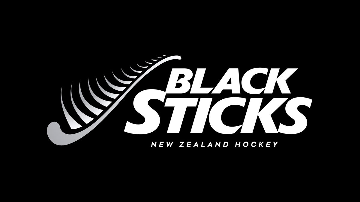

We took a look at the different component parts of the original logo then isolated potential improvements to the messages it sent and the design aesthetics used. One of our main focal points was the national use of the silver fern with sporting codes in the country. What were the improvements that we could make?


The head of the 'hockey fern' doesn't clearly resemble either the hockey stick's head, nor the classic curled up fledgling fern. In isolation, there isn't a clear link to hockey.

The the hook of the stick, likewise, can be further improved to lean either towards either a hockey stick, or a, unfurled fern. Refining this along with A would go much further to making an internationally recognised 'hockey' symbol.

Here, the leaves of the fern have been stylised to elicit movement, or the swinging of the hockey stick. However, this doesn't resemble the 'fullness' of a New Zealand fern (it's a plant with thick leaves), nor does it pair with an item with only passing resemblance to a hockey stick.

In the title wordmark, there's a clear hierarchy between 'Black' and 'Sticks', despite there be no distinction between them in common naming conventions of the team.

The 'S' likewise is larger (and therefore thicker) than the succeeding letters, leading to three different letter sizes within one wordmark - not including the 'Hockey New Zealand' clarifier.

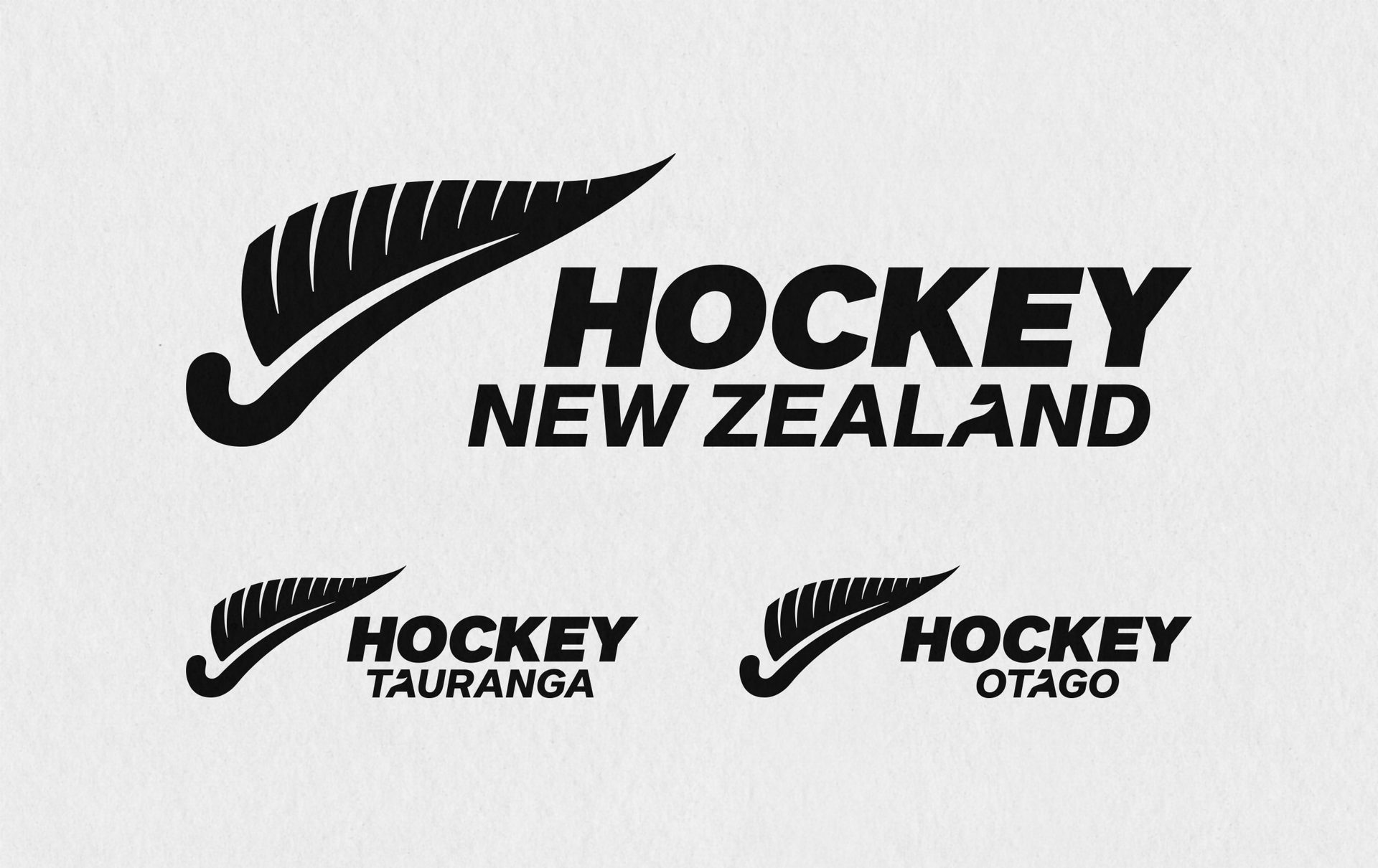
'Hockey New Zealand' in this context may be obsolete. Many other sporting teams have alternate logos that cover codes. For example, the All Blacks (rugby) have New Zealand in an alternate logo for special cases; the Black Caps (cricket) often play without any mention of name at all, only their fern.


'Hockey New Zealand', and with it some provincial organisations, utilise the same fern in novel new ways which could be collated.

Hockey New Zealand, in its organisational logo, chose a different orientation for the fern, laying it flatter and partially distressing the effect of the stick's swing.

An effort was made to incorporate the 'O' in hockey as a ball being struck with a key line the only separationbetween the mark and name.
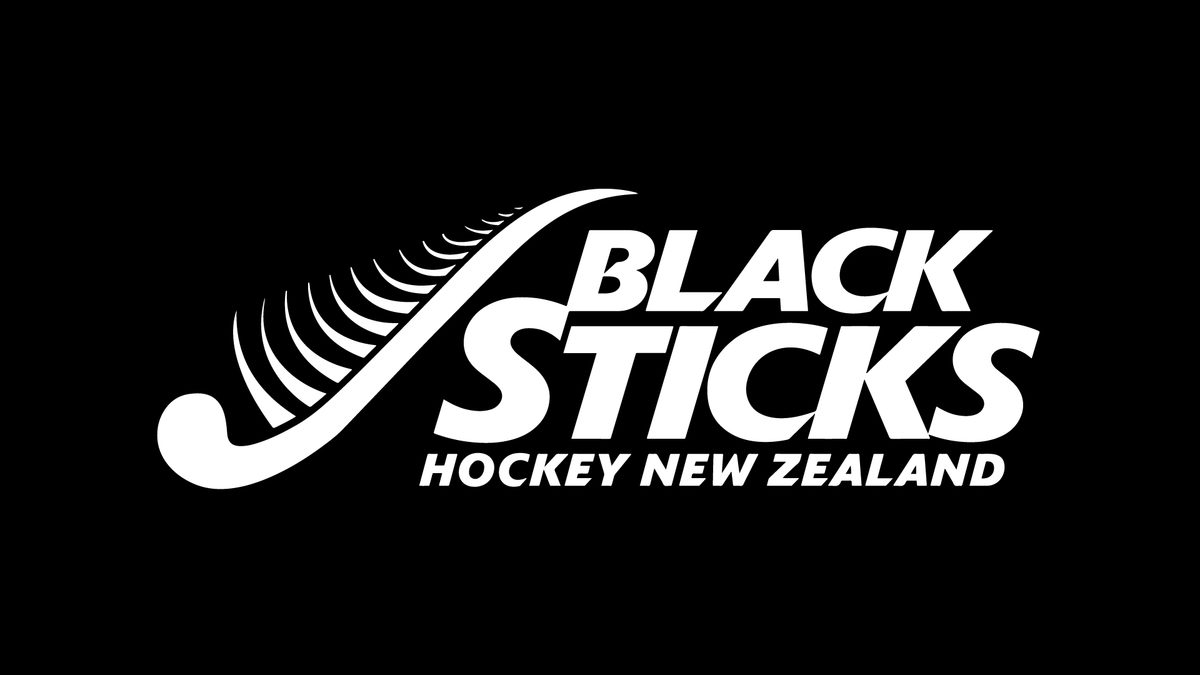
All said and done, we're quite fond of the Black Sticks logo, but we felt there was potential to improve the look, bringing it in line with other contemporary sporting codes and updating it to appeal to a more modern audience. This would need to be done without recreating the foundation for the Black Sticks' fern, however, to ensure parity and recognition for those already familiar with the brand.
There's a wonderful connection between the country, the people and the sports they play here in New Zealand. There are so many opportunities to try a variety of sports here that we wanted to ensure we were making the right connections not only with hockey players, but New Zealanders across the world. Our research and mood-boarding led us on a journey through the country as a whole.


We made a more conscious decision to represent the hockey stick within the mark, laying a more relatable foundation to the sport.
The fern itself became 'fuller' and better connected to New Zealand's natural appearance and established sporting symbology.
The logomark itself weighs more, creating a visual equality to the wordmark - the original logo heavily favoured the wordmark.
Edges retain softer, rounded, natural corners even in the points.
We integrated the fern into the negative space of the wordmark for cases when we want to further accentuate the 'Black Sticks' name. Keeping a slanted, action-suggesting font style, we pared back the other bespoke alterations to allow easier cross-use throughout all the Black Sticks' messaging.
By tweaking the font sizes within the wordmark, we created more parity between 'Black' and 'Sticks'. We erred on the side of maintaining the original hierarchy, but brought them closer together so they didn't appear separate.

The subtexts below the wordmark appear lighter and below the baseline, ensuring we can create and necessary 'sub-brands' without the need to redesign the balance within the logo. This allows for easier inclusions or exclusions of qualifiers.
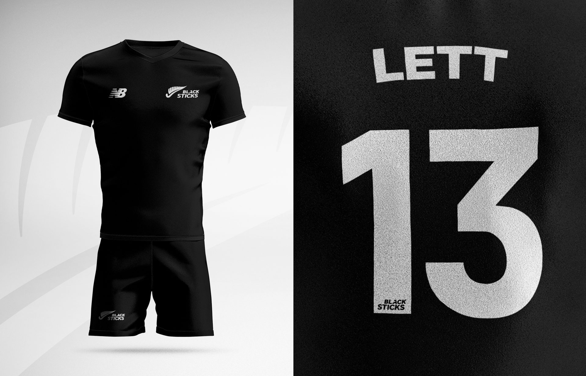
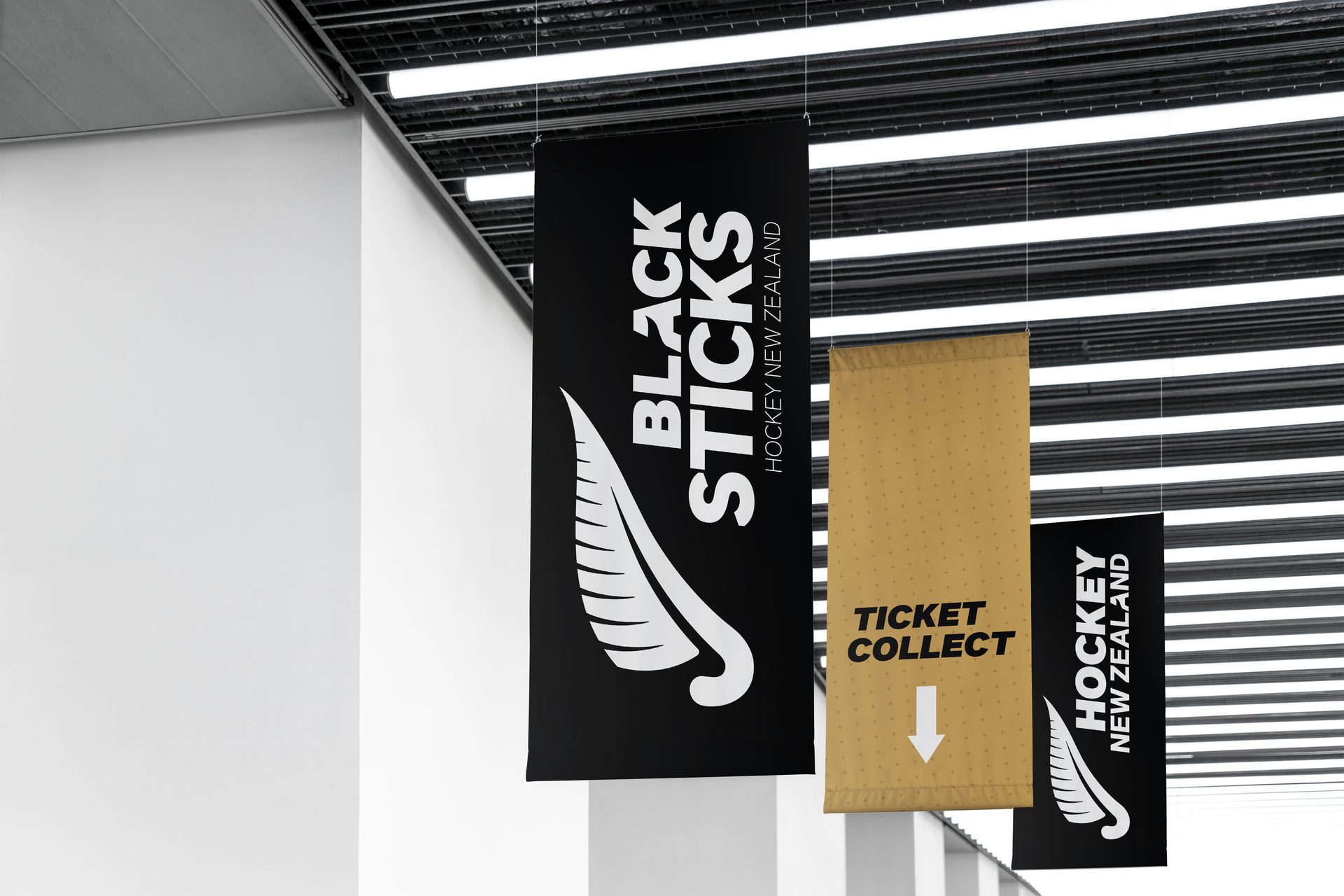
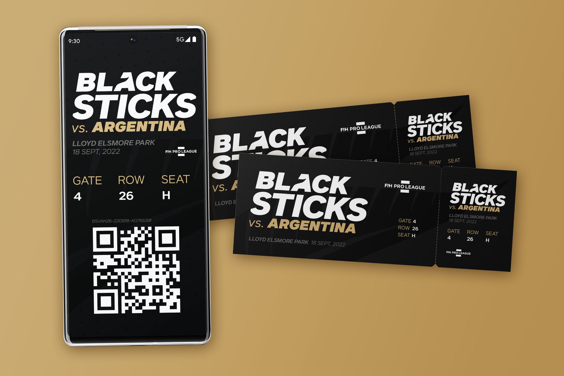
What's a logo without a suite of sharp designs to accompany help portray the message? This message started with the idea that we wanted to portray gold, and its connotations, as the accent to everything associated with the Black Sticks going forward.
HEX: #000000
RGB: 0.0.0
CMYK: 30.0.0.100
HEX: #060606
RGB: 6.6.6
CMYK: 0.0.0.98
HEX: #f4f4f4
RGB: 244.244.244
CMYK: 3.2.3.0
HEX: #c19e62
RGB: 193.158.98
CMYK: 25.36.71.2
A special thanks to Danielle Lett for lending us her likeness, and Reuel Newman for allowing us use of his photography.


Interested in seeing more?
Explore Karen Murrell
We're just a message away

